Moving Humans - Smart Directory Software
Took a 55-inch outdoor smart city kiosk from first wireframe to deployed hardware in five cities, where the hardest problem was letting each city customize the interface without letting anyone break its accessibility.
- Role
- Product Designer
- Team
- COO and Design Lead, software engineering
- Timeline
- May 2024 - Oct 2024 · 6 months
- Platform
- Outdoor Touch Screen · Windows
TL;DR
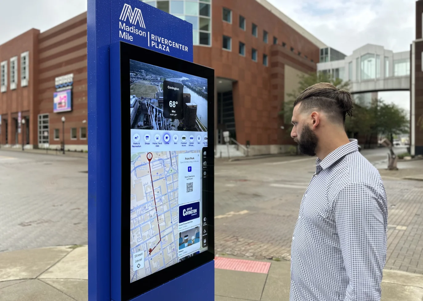
Deployed to 5 cities on over 50 double-sided kiosks from the east coast to the midwest, as public infrastructure serving tourists, residents and city staff.
The problem
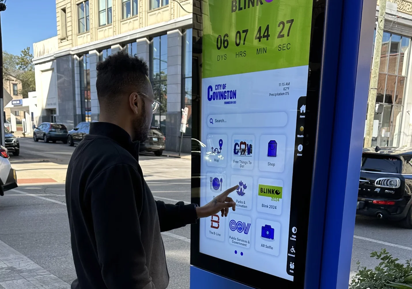
Cities wanted a way to reach residents and visitors in the street, not in an app nobody downloads. The product was a 55-inch double-sided outdoor touchscreen: navigation, local services, events and civic contact, standing on a sidewalk in whatever weather and light the day provided.
I joined as the Product Designer and took it from first wireframe to deployed hardware, working with our COO, who was also the design lead, and the software engineering team. It was the first time I owned a platform end to end rather than a feature inside someone else's product.
The constraints that shaped everything
It is not a phone
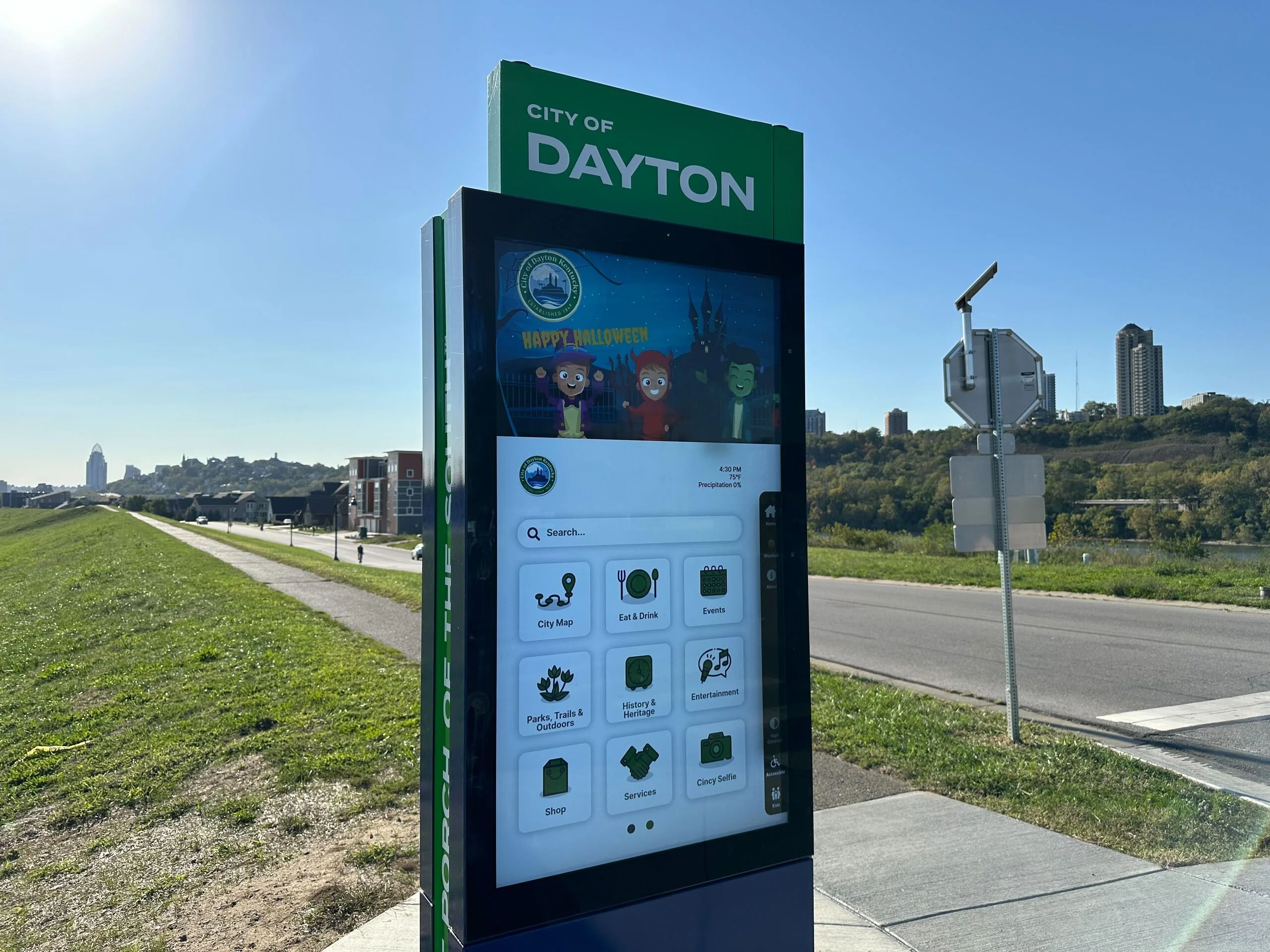
A five-foot screen in direct sunlight changes every assumption. Touch targets had to work for every hand size and reach height, including someone in a wheelchair. Type had to be legible for a person standing at the glass and for someone deciding from ten feet away whether the thing is worth approaching. Contrast had to survive glare. Every one of those is a physical-world consequence you never think about designing for a phone.
It is public infrastructure, not an app with an accessibility checklist
The users were tourists who do not read English, elderly residents who did not ask for a touchscreen, wheelchair users, and kids treating it like a toy. Multilingual support and ADA compliance were not features to schedule, they were the floor. Designing for that range in public raised the bar on every pattern I chose.
Five cities meant five sets of stakeholders
Every deployment brought city employees, tourism boards, private press partners and emergency services, each with a view on what belonged on screen and in what order. They sometimes overruled our recommendations. The interface still had to look deliberate afterward.
What I decided
Customization as a system, not a concession
The stakeholder problem was the real design problem. I could not design one screen and defend it in five cities, so I stopped trying. I designed a platform where branding, colors and app selection are configuration, managed through a CMS the city controls without needing a designer.
The decision that made it hold up was constraining what could be customized. Cities choose content, palette and which apps appear. They do not choose spacing, type scale, touch target size or contrast, because those are the things that keep it legible and ADA compliant in the field. Customization stops exactly where usability starts.
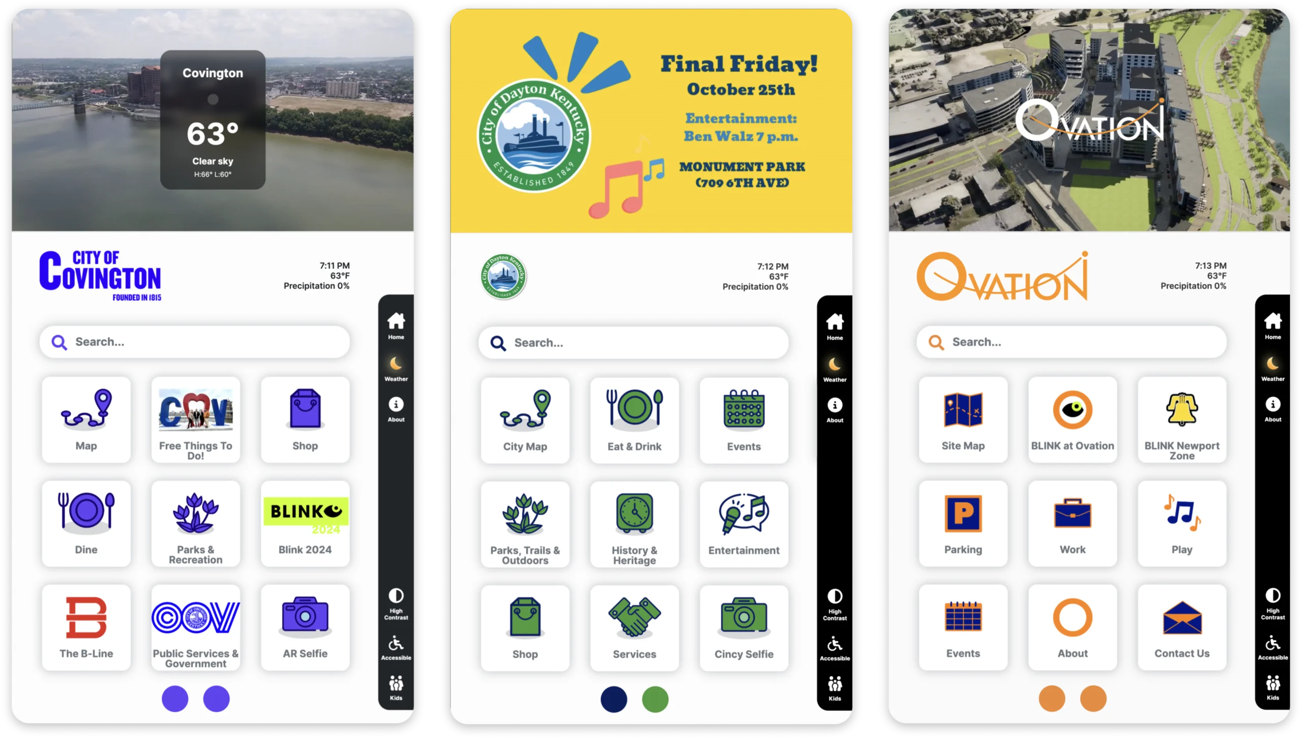
Design principle: let cities own the identity, keep the accessibility floor non-negotiable. A stakeholder should be able to make a bad taste decision without being able to make an unusable one.
Navigation built for how people actually leave
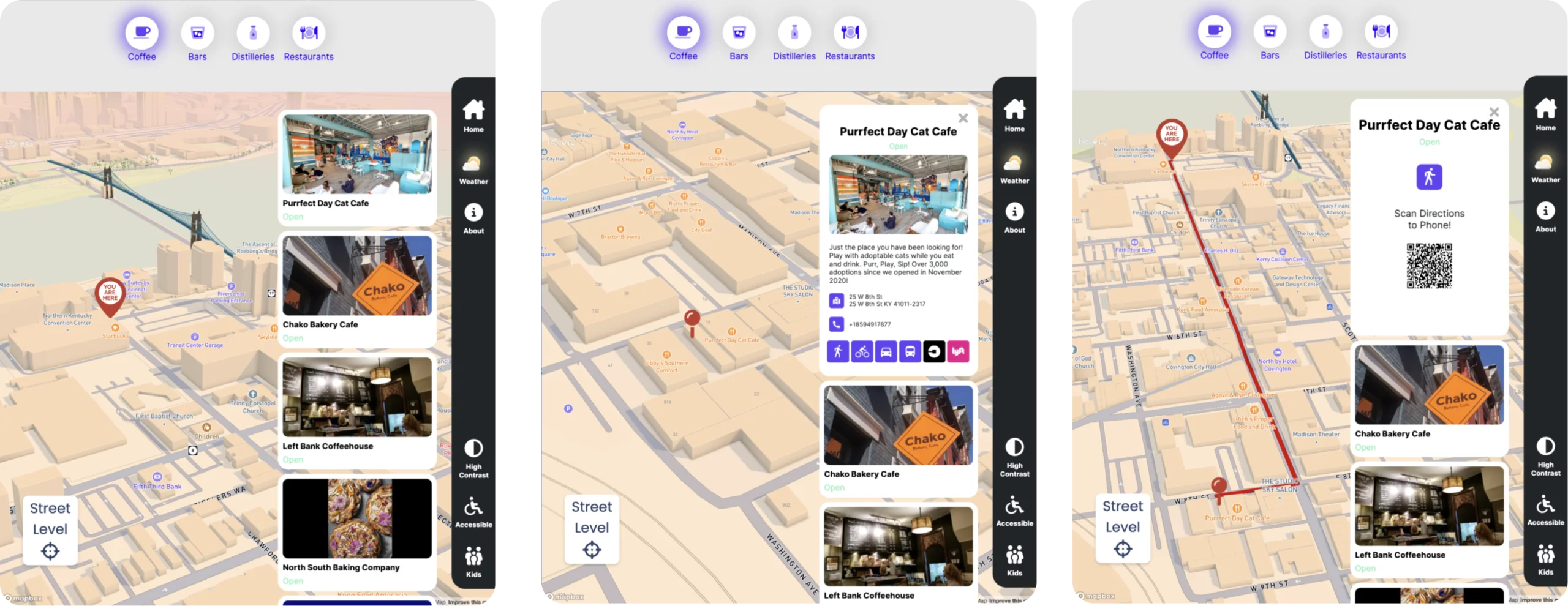
The map was the centerpiece: city points of interest, search, and turn-by-turn directions for walking, driving, transit and biking, plus handoff to Uber and Lyft.
Multi-modal routing was a deliberate cost. It would have been cheaper to ship walking directions only. But a kiosk that can only route you on foot is useless to the majority of people standing in front of it, and the moment it fails someone once, they never try it again. Public hardware gets one chance.
A civic channel, not a poster
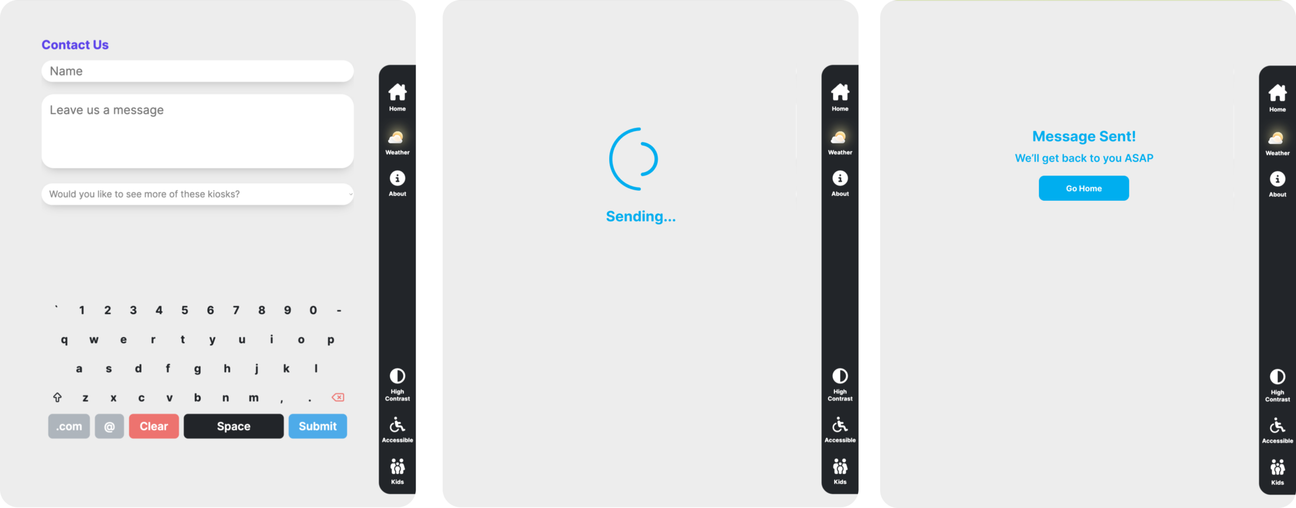
An integrated contact form let people report issues and reach city representatives directly, which turned the kiosk from a display into a two-way channel. That reframed it for the cities buying it: not signage, but a service surface.
One playful thing on purpose
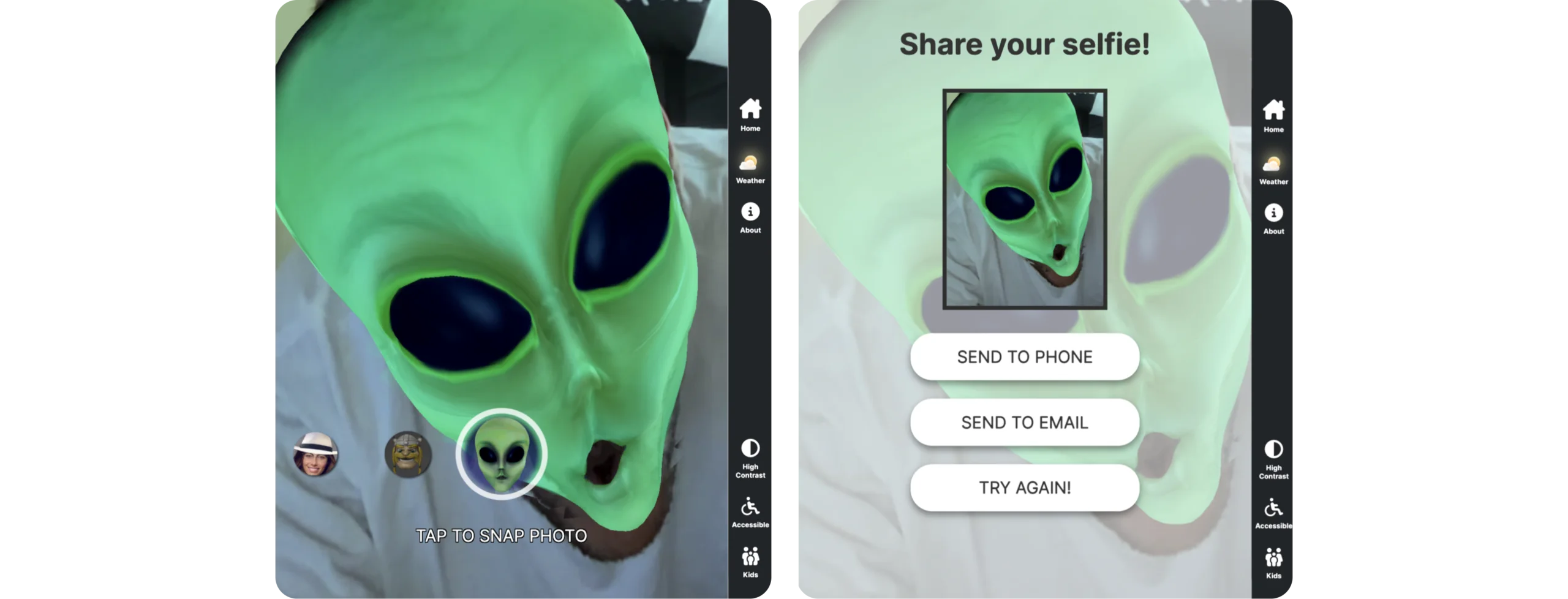
The AR Selfie app lets visitors capture a moment with augmented elements. It is the least utilitarian thing in the product and it is there deliberately. Public infrastructure does not have to feel like public infrastructure, and a reason to touch the screen for fun is a reason to discover the screen does other things.
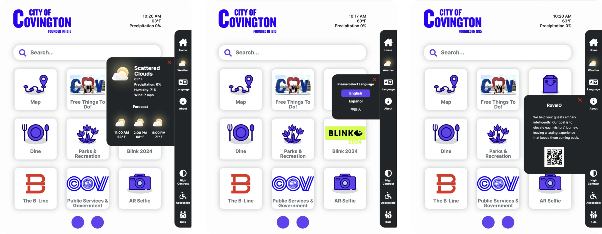
Real-time weather, a language selector and a configurable About widget rounded out the utilities. Each looks trivial and each needed its own thinking about behavior on a public screen in changing conditions.
Trade-offs
Cities could adopt the product without a design team, and each deployment felt like theirs. It also meant we could sell into the next city without redesigning anything, which is what let one product reach five of them.
Every screen had to survive combinations I would never choose myself, so nothing could depend on a specific palette or a specific set of apps being present. That ruled out a lot of the compositional control a fixed design would have given me.
People walk up with no instruction, no onboarding and often no shared language. Leaning on decades of existing kiosk and map conventions meant they could act immediately instead of learning our ideas first.
The result is less distinctive than what I first sketched. I spent early weeks trying to reinvent kiosk software before accepting that originality was the wrong goal for a surface someone uses once for ninety seconds.
Outcome
The Smart Directory platform deployed to five cities on more than fifty double-sided kiosks, from the east coast to the midwest. That is over a hundred screens of public infrastructure running the interface, in real weather, in front of people who did not choose to use it and had no way to ask for help.
The platform became the foundation the company built on afterward. The modular app model, the CMS-driven customization and the mapping work all carried forward into the products that followed, including the responsive web and mobile wayfinding product I led the following year.
What I learned
Do not reinvent the wheel, stand on it. I spent too long looking for an original answer and looked straight past decades of existing kiosk research. The breakthrough came when I stopped trying to be original and started being informed. The good decisions came from understanding the established patterns well enough to know the few places worth departing from them.
Ask for the uncomfortable feedback. My mentor Russ coached me through the moments I was stuck, and those conversations caught more than my own reviews did, from small UI mistakes to foundational UX problems in the software. Learning to invite critique, and to sit with it long enough to actually use it, was the most valuable skill I built here.
Protect the user, including from the stakeholders. When a request would have hurt usability, I had to make the case with evidence rather than ego. I did not win all of those. But designing the accessibility floor as non-negotiable meant the losses were about taste, not about whether someone could read the screen. Putting the guardrail in the system was more effective than winning any single argument.
A platform is a market decision. Concept to deployed hardware across five cities taught me that the choice to make customization a feature is what let the product travel. I had been thinking of design systems as an internal efficiency. Here it was the reason the thing could be sold twice.
The software displayed here, along with all related processes, is the intellectual property of RoveiQ. All designs, features, functionalities, and software processes are proprietary to RoveiQ and are protected under applicable intellectual property laws. Nothing in this showcase is outside of public knowledge, and no confidential customer data is shared.
 Charles J. (CJ) Dyas Product designer in Cincinnati, OH.