I Had 30 Minutes to Design a Homepage. Somehow, It Won.
 Charles J. (CJ) Dyas
Thirty minutes is not enough time to do a normal web design project badly. It is enough time to choose one visual idea and see whether you actually believe in it.
That was the setup for the 2023 Cincinnati Design Week Figma competition at UC's 1819 Innovation Hub. We were given a basic wireframe, a small bundle of images and content, and half an hour to turn it into a homepage for the Inclusive Design Institute.
It was my first design competition. I had done the very useful pre-event work of looking around the room, deciding everyone else was probably better than me, and wondering why I had applied.
Then the timer started. Weirdly, that fixed it.
The timer did me a favor
Most of my bad design habits need time to breathe. I can audition six typefaces, move a block four pixels, move it back, and call the whole thing exploration. None of that survives a 30-minute clock.
The brief needed a homepage, not a tour of my Figma technique. I needed a clear hero, a way into the institute's work, updates, team information, and enough repetition that the page felt intentional from top to bottom. The wireframe gave me the content order. My job was to give it a point of view.
I stopped thinking about what the other designers might be making because there was no useful action attached to that thought. The only question left was whether the next decision helped the page communicate.
That is a much calmer place to design from.
I picked one visual language and got stubborn about it
The winning direction is basically one high-contrast system pushed as far as I could take it in the time available.
I used black as the canvas, white for the working type, and a sharp acid green for emphasis. The green marks calls to action, frames photography, and pulls important words out of large headlines. It does several jobs, which matters when there is no time to invent a special treatment for every section.
The typography carries most of the hierarchy. The hero statement is huge, uppercase, and broken into short lines so it reads more like a poster than a conventional nonprofit homepage. Behind it, a dot grid gives the empty black space some texture. Bent outlines, oversized asterisks, and contour-like lines repeat farther down the page. None of those elements are complicated. Repeating them is what makes them feel like a system.
Photography gave that system a human center. The large cutout portrait in the hero has enough scale to compete with the headline. Smaller documentary-style images then sit inside the same green framing language throughout the updates and team sections. The page can move between expressive type and real people without looking like two different concepts stitched together.
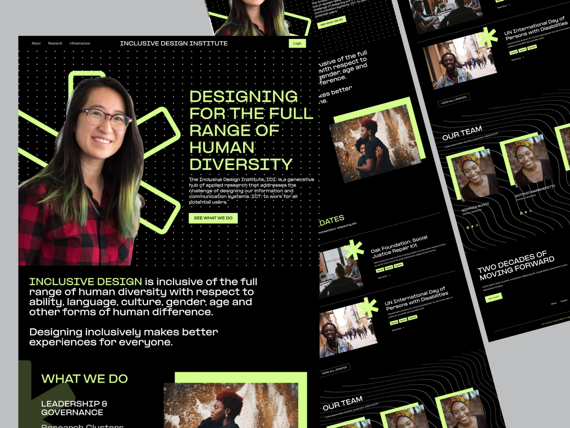
Looking at it now, I can see exactly where the clock helped. I did not have time to sand the personality off the page. The composition is dense, a little loud, and willing to let elements run close to the edge. With another two hours, I might have “fixed” some of the energy that made it stand out.
The timer also forced reuse. Once the dot field, green frame, and outlined geometry existed, every new section had to speak that language. I was not building a formal component library, but I was still designing a small visual system. It just happened at panic speed.
It won. I still would not ship it as-is.
When they announced my name, I was genuinely shocked. There is photographic evidence of me looking like someone had just handed me a small lottery check.
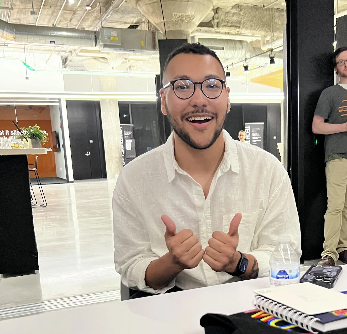
Winning felt incredible, especially for a first competition. It also did not make the screen finished.
This was a static concept produced for a timed visual challenge. A real homepage would need the less glamorous work that the screenshot cannot prove: responsive behavior, keyboard order, semantic structure, image treatment, actual content states, and accessibility testing. Some of the small secondary text would need more room. The all-caps display typography works as a graphic statement, but I would be much more selective with it across a live site about inclusive design. The green-on-black palette would get tested, not trusted because it looks bright.
That gap is useful. Competition design rewards how quickly an idea communicates. Product design has to survive contact with content, devices, assistive technology, and people who did not watch you make it. The winning file was good at the first job. It had not yet attempted the second.
What I took from the night was not “trust your instincts,” at least not in the motivational-poster sense. Instinct is mostly compressed practice anyway. The useful lesson was to choose a rule early enough that the rest of the work can argue with it.
For this page, the rule was simple: high contrast, human photography, oversized type, one graphic language. Every decision either reinforced that or wasted time.
I do not want every project to take 30 minutes. That sounds miserable. I do occasionally want the first 30 minutes to feel like this one did: commit to a direction, make enough of it to judge honestly, and save the tiny nudging for after the idea has earned it.