What Frutiger Aero Understood About Making Interfaces Feel Alive
 Charles J. (CJ) Dyas
I miss old interfaces for embarrassingly specific reasons.
The Wii Menu gave its pointer a tiny gloved hand and made every channel feel like a slot you could reach into. Windows Vista treated a window like a sheet of tinted glass floating over the wallpaper. Early iPhone icons did not share one material. The Notes icon was paper, Settings was machined metal, and YouTube was a little television.
Some of it was tacky. A lot of it was inconsistent. I still miss the conviction behind it.
I do not want every calendar to look stitched from leather again. What I miss is the idea that software can feel like a place, not just content arranged inside rectangles. Frutiger Aero was particularly good at that. Blue skies, grass, bubbles, glass, plastic, soft shadows, tiny highlights. It imagined computation as something clean, friendly, and almost physical.
Frutiger Aero and skeuomorphism are not the same thing. Frutiger Aero is an aesthetic world. Skeuomorphism is a way of borrowing familiar properties from physical objects. They overlapped constantly, but a glossy blue button can be skeuomorphic without the field of green grass, and a nature wallpaper can be Frutiger Aero without explaining how anything works.
That distinction matters because nostalgia tends to flatten both into “old UI looked better.” Sometimes it did. Sometimes it was a pile of bevels fighting for attention. The useful question is what all that depth was doing.
A bevel is low-resolution physics
A good beveled button contains a tiny model of light.
The top edge is brighter because it faces an imagined light source. The bottom edge is darker. A shadow separates the control from the surface below it. Press the button and those relationships tighten or reverse. The interface does not need to write “this object moved down.” Your visual system already understands the event.
That is what the best dimensional interfaces bought with all those gradients: state was visible in the material.
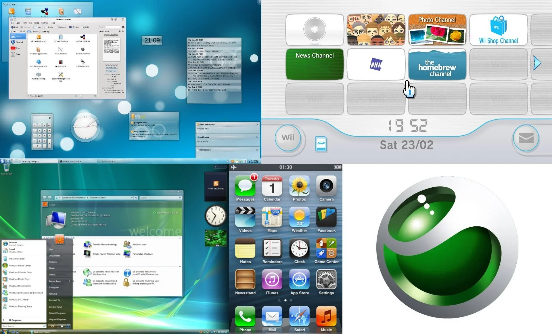
Look at the Wii channel slots. An empty slot is recessed and quiet. An active channel has an image, a boundary, and a cursor that changes when it can grab something. Vista used transparency to keep a window connected to the desktop while still separating the application from what sat behind it. Early iOS icons had distinct silhouettes and textures, which made a screen full of software easier to scan before every product had years of brand recognition.
The material was doing semantic work. Raised things could be pressed. Inset things could receive content. A floating thing belonged to a different layer. Motion showed where an object came from and where it went.
It could also become exhausting. Every toolbar wanted a highlight. Every app invented its own wood, felt, glass, or brushed metal. Texture competed with content, and physical metaphors became awkward when the software needed to do something the physical object never could. A bookshelf is familiar until it needs search, batch selection, cloud sync, and six hundred items.
Frutiger Aero was not automatically good UX. It was good at giving an interface atmosphere, and sometimes good at making state tangible. Those are separate achievements.
Flat design fixed a real scaling problem
Flat design did not arrive because an entire industry suddenly lost its soul. It was solving real problems.
Microsoft's design language around Windows 8 pushed “content before chrome,” a principle its own design team described as giving the thing being viewed or edited more visual prominence. The Start screen used type, color, layout, and motion instead of simulating a desktop full of objects. That was not an absence of design. It was a different theory of where the interface should live. Microsoft documented that thinking while redesigning Visual Studio.
iOS 7 made the break feel even larger because it replaced years of richly rendered icons almost overnight. But even iOS 7 was not truly flat. Apple's launch materials described distinct functional layers, translucency, and motion. The leather and green felt disappeared. Depth moved out of texture and into composition.
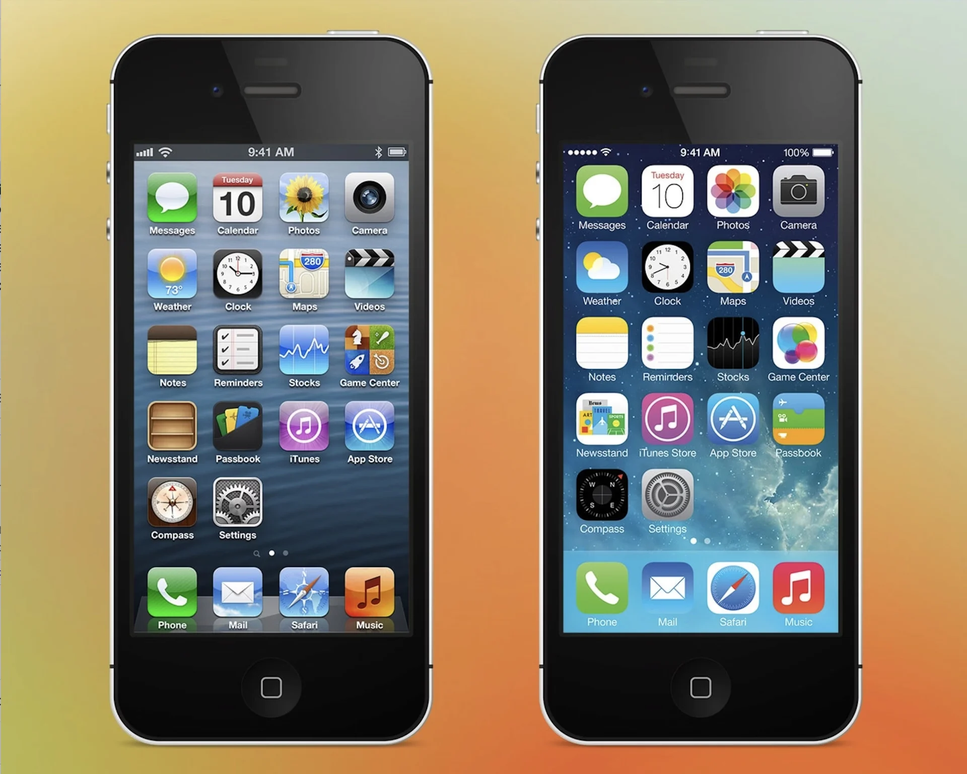
Simpler geometry also made interface systems easier to extend across screen sizes, pixel densities, themes, and large component libraries. A designer could express hierarchy with type scale, spacing, color roles, and a smaller set of reusable surfaces instead of producing a tiny illustration for every control. Product teams gained consistency and speed. Content got more room.
The trouble started when “remove unnecessary decoration” became “remove every visible clue.”
A modal is still above the page even if it has no shadow. A button is still an action even if it looks exactly like a label. A selected tab still changed state even if the only evidence is a two-pixel line. Flat design did not remove the software's layers. It sometimes made the user infer them from weaker signals.
This is where the argument gets more technical than glossy versus minimal. Interfaces always have a z-axis, even when the visual style pretends otherwise. Menus open over content. Sheets interrupt a task. Dragged objects cross containers. Focus moves between surfaces. If depth, motion, position, and contrast are all suppressed at once, the structure still exists in code but becomes harder to read on screen.
Flat design's best contribution was discipline. Its worst habit was treating visibility as decoration.
Depth came back with a job description
Modern interface systems did not quietly admit that Frutiger Aero was right all along. They did something more useful: they turned depth into a constrained part of the system.
Material Design 3 defines six elevation levels, each representing a relative distance between surfaces. That makes a shadow more than a styling flourish. It is the rendered consequence of a component's place in the hierarchy. A dialog, menu, and resting card should not all float at whatever depth happened to look nice in one mockup.
Apple's Liquid Glass is even more explicit about where material belongs. Apple's Human Interface Guidelines describe it as a distinct functional layer for controls and navigation, sitting above the content rather than becoming the content. The WWDC material guidance tells designers not to stack glass inside glass or spread it through the content layer, because the effect stops communicating hierarchy when everything uses it.
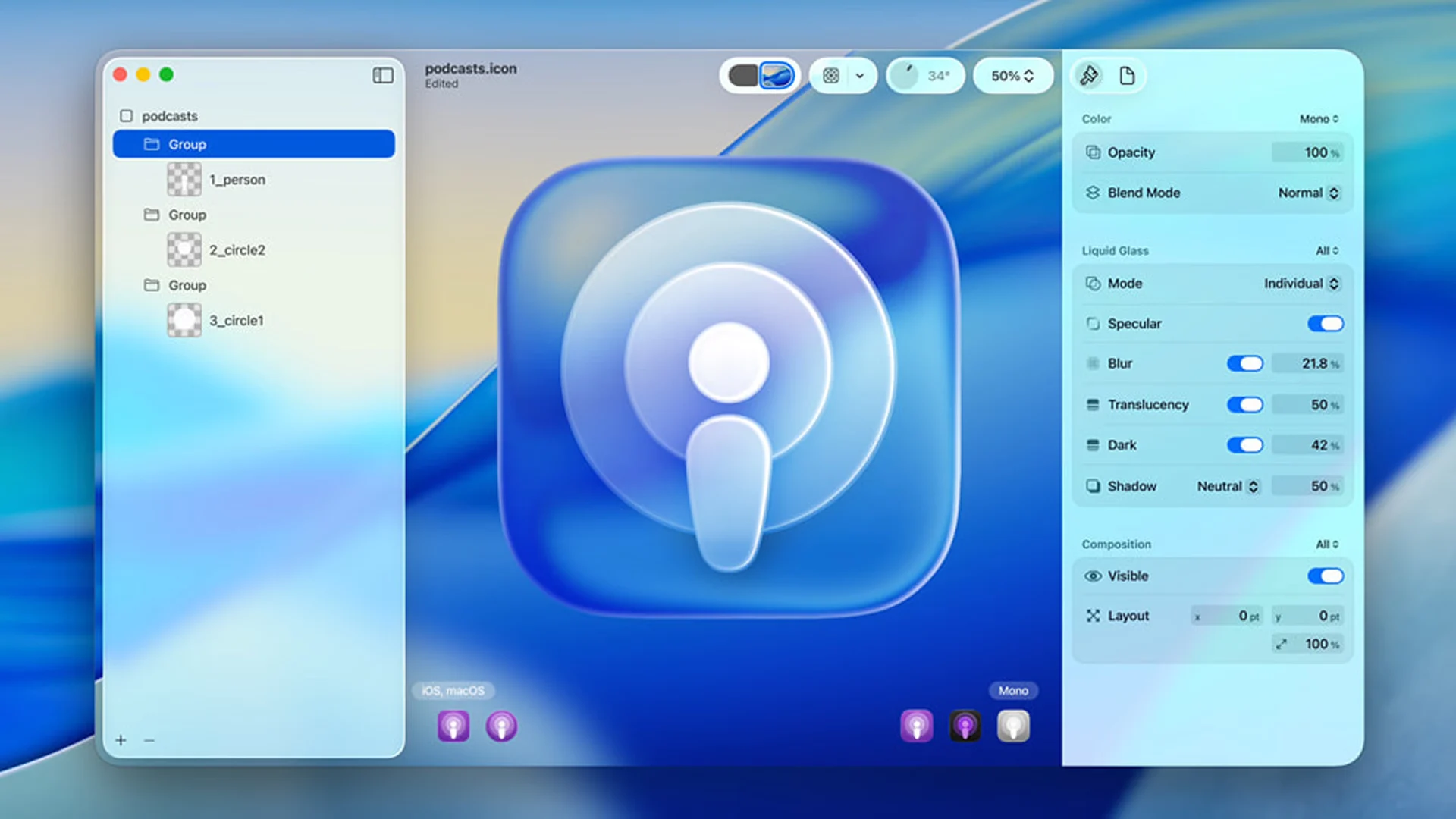
That is not a return to a static Aqua texture. Liquid Glass changes with the content behind it, adjusts the treatment of symbols for contrast, and responds to interaction with light and motion. The system is trying to preserve continuity between states while keeping controls visually separate from the content they operate on.
It is also easy to misuse. Transparency makes contrast dependent on whatever happens to scroll underneath. Blur and refraction can turn a stable control into visual soup. Motion that helps one person understand continuity can distract or disorient someone else. A convincing material has rendering costs, accessibility states, and failure cases. It needs fallbacks. “Looks like glass” is not a sufficient component specification.
The interesting return is therefore not gloss. It is causality.
A surface looks raised because it temporarily sits above another surface. A control catches light because it is interactive. A menu appears from the control that opened it. A pressed state deforms because the input changed. Material, motion, sound, and hierarchy all describe the same event.
When those signals agree, technology starts to feel responsive instead of merely animated.
What I actually want back
Pomodorii is probably the clearest evidence of what I mean. I built it as a Wii-inspired timer, but the useful part of that influence was never a blue gradient by itself. It was the way the Wii made simple actions feel acknowledged.
In Pomodorii, picking up a task, starting a session, pausing, and finishing all have their own motion and sound. The interface has a visual personality, but the personality follows the state. A rising tone confirms one kind of action. A softer descending cue communicates another. Rounded forms and springy movement make the tool feel approachable, while the timer underneath still has to remain accurate and recover from the browser going to sleep.
That is the version of “soft tech” I care about. Not a skin. A system with enough character that people can feel what it is doing.
I still love the green hills, bubbles, silver plastic, and impossible blue water of Frutiger Aero. I just do not think importing those assets into a modern interface would recover what made the era special. The optimism came from treating computation as a new material worth exploring. Copying the wallpaper would be the least optimistic thing we could do.
The better inheritance is a set of questions. Does the interface reveal what can be touched? Does a state change feel connected to the action that caused it? Can someone tell which layer owns the next decision? Does the personality survive reduced motion, increased contrast, and a slow device? Is the delight carrying information, or standing in front of it?
I do not want skeuomorphism back as a rule. I want software that is willing to have physics, rhythm, and a point of view again. Flat design taught us how to remove. The next interesting systems will know what deserves to be put back.